
Mitchell Wagner
Logo redesign can be a touchy enough subject as it is. The logo can be a big part of what defines the brand, so naturally companies get tied to their logo and are afraid to change it. In our instant gratification world of social media, the subject is getting touchier.
Many are familiar with the short-lived GAP logo redesign that sparked an instant internet backlash, and resulted in them dropping the new design just days after it was released. Years ago, that backlash would have taken much longer to catch on and may not have caught on at all. But thanks to all the new instant communication vehicles, the effects came almost immediately. I recently attended a marketing event where the speaker touched on this very subject. Did GAP do the right thing by responding and quickly changing back to its original logo? It’s tough to say. I mean, they did listen to the customer and respond. But there will always be people who are resistant to this type of change for one reason or another, whether it be bad aesthetics or perhaps they have some nostalgic memories tied to the logo.
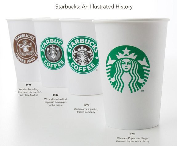
Enter Starbuck’s, the next big company to do a re-brand. Expectedly, this has been met with instant backlash. Its corporate social media platforms are being bombed with comments about the new
logo, both for and against. Starbuck’s likely saw this coming, but chose to do it anyway. You may be asking yourself, “Did they not see what just happened to the GAP? Are they crazy?” Maybe. Or maybe they sat down, planned this out, and said, “Yes there will be backlash, and yes some people will dislike it. But, we are going to do it because it’s the right move for us.” And I have to say, I actually don’t mind the new logo. I think Starbuck’s got it right because, unlike the GAP, they kept a major element from all previous logos, and used it prominently. The company understands people have made a connection with this one element – the iconic mermaid – and chose to carry it over into the new design.
Still, logo redesign will always be a sensitive subject. And unfortunately, there’s no expiration date on logos, so it’s up to each company to decide when the time is right for them to make the change. My advice to any company considering a new logo redesign is this – put some real time, thought, and effort into it. It is more than just slapping on a fresh coat of paint. Look at your current logo and see how it reflects on your company and products. And try to get an outside opinion; sometimes we get too close to things and can no longer see them objectively.
Do you have any positive or negative logo redesign experiences? What do think of the new Starbuck’s logo? Do you think it survives the backlash or will they scrap it and go back to the old one? I think they will keep the new one — try to ride out the storm. After all, they know that next week there will be a different hot topic.
